Orange France - Data Center Performance Study Platform
Visualize and Optimize Performance

Project: Design of a management platform for data center managers at Orange
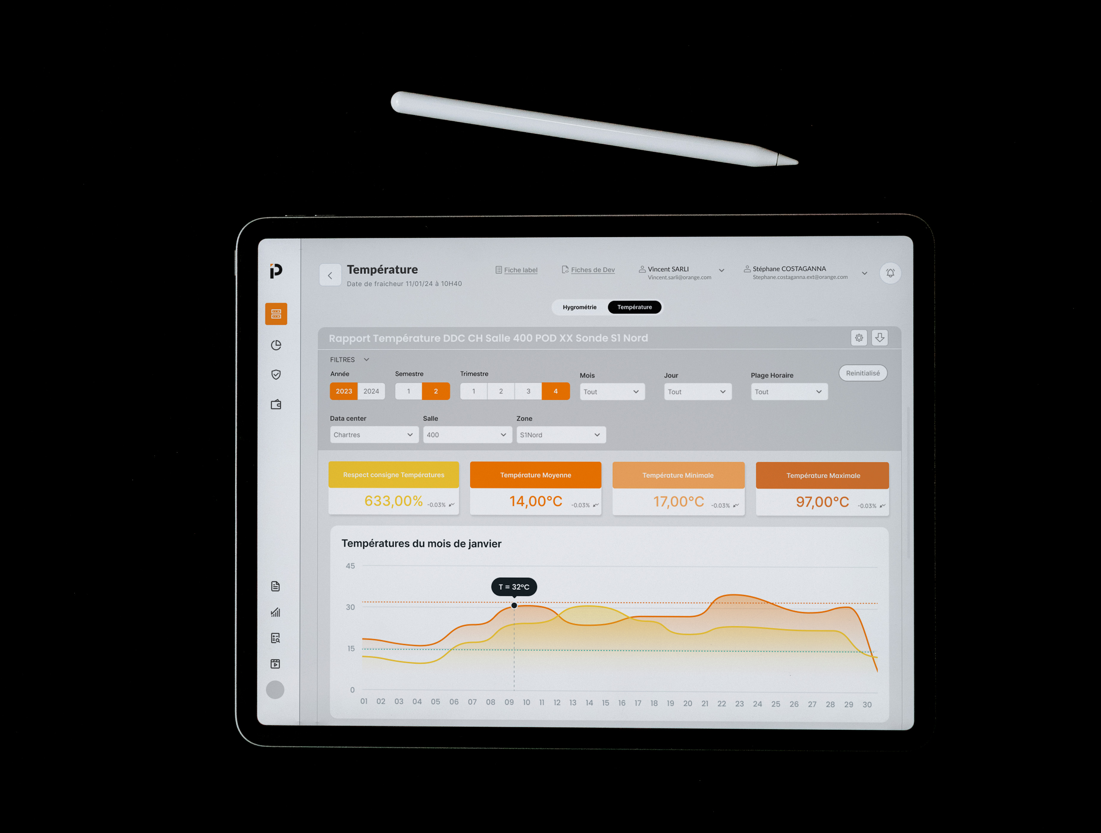
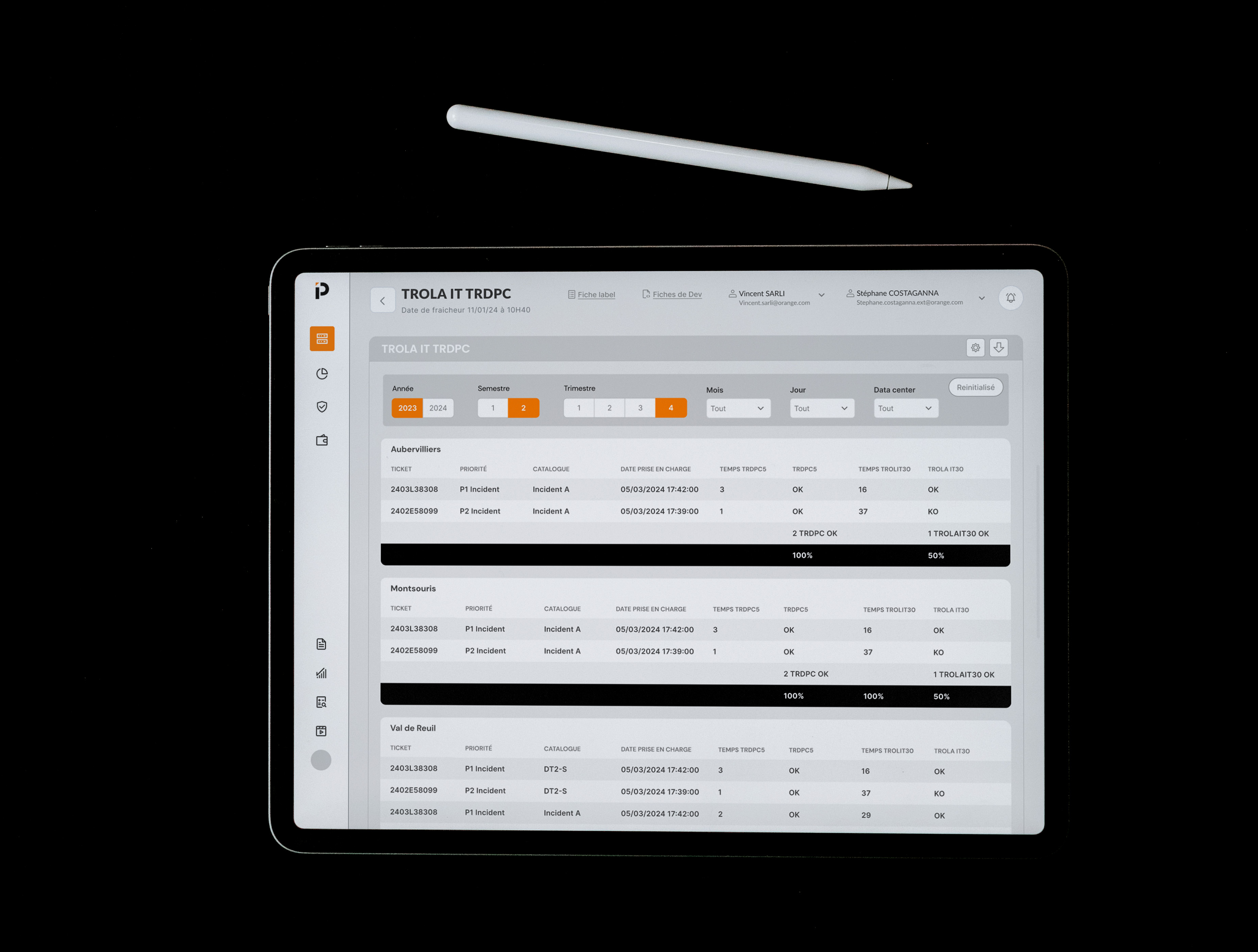
Objective: Centralize performance data and optimize decision-making through key KPIs
My role:
. Design of a clear and accessible interface to transform complex data into visual dashboards.
. Creation of an intuitive navigation that facilitates analysis at various levels.
. Collaboration with stakeholders to simplify the visualization of critical indicators.
UX approach: Focused on user needs and optimizing data visualization
Methods used:
. Interviews with directors, technical teams to understand performance monitoring needs
. Study of existing tools to identify the shortcomings and propose a more ergonomic solution
. Co-design workshops to define the key indicators and structure the interface according to the expectations of decision-makers
. Simplified chart and dashboard design, rich in usable information
. Iterative user testing to adjust the routes and improve readability
. Heuristic analysis to ensure intuitive navigation and prioritize KPIs (alerts, trends)
. Making technical data accessible to a non-technical audience while maintaining a thorough analysis
. Insure the update in real time KPIs
. Harmonize and standardize indicators due to the diversity of data sources
. Guarantee optimal ergonomics and clarity of information to avoid cognitive overload for directors
. Improving visibility on performance data centers and identification of areas for improvement
. Fast access to information reviews thanks to a dynamic interface
. Centralization of KPIs optimizing infrastructure monitoring and strengthening team coordination
. Contribution to more agile and effective management resources, improving the overall performance of data centers